Gabrielle Fulton Photography

Tag: #colour

Artist Research – William Christenberry.

Having already looked at deer beds by Katherine Wolkoff and Lick Creek Line by Ron Jude, someone suggested I look at William Christenberry’s work.

William Christenberry is a photographer, painter and sculptor who works with personal and somewhat mythical themes growing out of his childhood experiences in Hale County, Alabama. He uses material to create his work that speak about the place of his childhood. during his career he began making annual visitis to Hale County each summer to explore and make photographs. On one occasion in 1973, Walker Evans, who had encouraged Christenberry to take his photographs seriously, accompanied him.

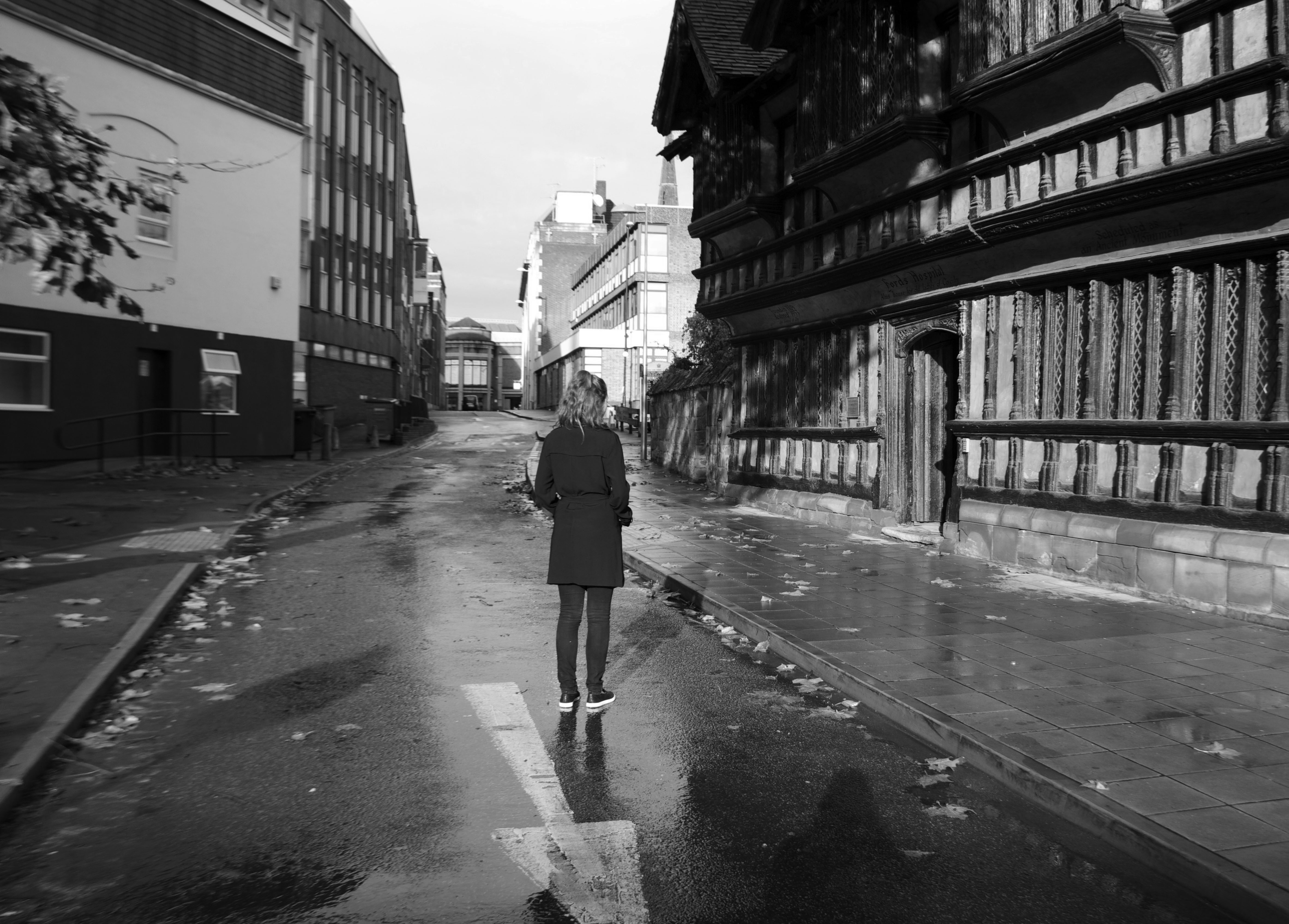
His work mainly consists of the vernacular buildings of the American south – wooden churches, shacks, houses, storefronts. The motivations behind his collections of work are things such as his family history and the importance of it to him, and the deep attachment he has to the places where he photographs, which are clearly shown through his repetition of going back to the same spots. Like my own work, Christenberry’s work shows no human figures but it is everything inside the photograph that creates this sense of attachment and presence of something that was once there before.

william-christenberry-10

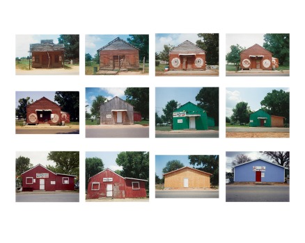
In terms of style, every photographic is very minimalistic, the layouts of each image are almost identical, reiterating the move of repetition in his work.  This layout and style reminds me a lot of the topographic movement and the likes of Bernd and Hills Becher’s work.  Using colour film creates this sense of the pictures being a time capsule of that era, you can quite clearly see the images are taken with the 60’s and 70’s era. This is something I need to think and consider about in terms of my work, by using colour, will it represent the time the image was taken in or will using black and white images create more connotations of the history of the buildings as we usually associate black and white photographs with history and the past.

Picbod- Identity; Constructed and Complex.

In this week’s lectures we delved into the ideas of identity, especially how it is structured and it’s complexities. The discussions turned to what makes up our identity? and here are a few points that were suggested,

what we look like?

Where we were born?

Our upbringing?

What we buy?

Our jobs?

All these thoughts lead on to more questions about identity and it’s  structure and if there actually is more to it than meets the eye?

Do we actually have control over our own identity? or do we change it to conform with what is expected nowadays on things like social networking sites like twitter and instagram?

For this weeks task we were given the task of creating a ‘mechanical montage’ of ourselves and one of a close friend or relative, which showed all the complexities of identity rather than attempt to keep it all provided neatly.

We were also given a few artists such as Jim Goldberg, Grayson Perry and Hannah Hoch to look at for inspiration.

When it comes to thinking about identity, I do believe we try to change our identity to fit in or to suit others, but I think that the one aspect of our identity that doesn’t change is our home and what we consider to be home, so I decided to explore this idea of what home is to my close friend and myself and see if the differences and similarities between our montages challenge or relate to  my thoughts on identity and home.

While we were all discussing mechanical montages, I immediately thought of John Stezaker’s work -Landscapes and Mask. In both series Stezaker superimposes found postcards onto old black and white images usually of stars from the 1940’s and 50’s. The postcards are placed over the faces as a ‘mask’ and opens up another window to explore within the image. The collages are so simple and effective that just by a small adjustment of one image it can create a whole new meaning and creates a whole new work of art. Along with the visual aesthetics of his work this is something I want to achieve within my mechanical montages.

DBPP2012-5-_JS__2325325a

 Here is the mechanical montages I created, please excuse the poor quality of image from scanning the images in.

%5bUntitled%5d (1) %5bUntitled%5d

Because of our very similar interests and personalities, I knew the final layout and presentation of each montage would be similar for example, we are both attracted to minimalistic aesthetics. However, the subtle differences represents the small differences between ourselves. In both montages, I have included a shape, picture of my friend and myself and a old image of a landscape. The shapes represent how many places we consider home for instance, my friend considers herself to have three places she would class as home, Coventry where she is living right now, Worcestershire -where she grew up and where her mother and sisters live, then Holland where her father currently resides. The images placed over our faces are photographs of the areas we class as our actual home which in my friend’s case is Worcestershire. In my montage however, the circle represents one place I consider home – County Durham, the image placed in front of my face is a picture taken an area I spent most of my childhood. It is interesting to see the differences between our thoughts on home, while we both class the place we grew up in as our ‘home’, we differentiate in our thoughts and feelings towards being attached to specific places, my friend is attached to three different places because of where her family members are and when they move, her ‘home’ changes, and while I also have the same feelings on where my family is, my ‘home’ wouldn’t change because of things such as memories that were created in that area and my love for the area’s landscape.

 Overall, I really enjoyed this task because this was not just a lens based task, it made it more interesting to be able to create different dimensions and layers to the images with different materials and sources than just using photo-shop. At the minute I would like to carry this on and experiment with it more to see what other outcomes I could produce.

250mc – Test shoot 1.

After looking at different artists work and re-planning the locations I want to take photographs at I decided to go out and take some tests shoots of the actual idea I have, to see if some of the locations worked and how would I actually take them. I used digital format as I was not able to get a hold of a medium format at the time. In these shoots there are no references to Lady Godiva as I haven’t still decided how I plan on doing that as of yet.

A few selected images from Test shoot 1.

ContactSheet-002

A few selected images from Test shoot 1.

Overall I am happy with how these test shots turned out. However, there are a lot of things I need to change and adapt before taking my final images. I took these images around 3pm and as you can see it was still extremely light, which didn’t work in my of photographs especially the photographs looking out onto the ring road. I personally think shooting later say at around 5pm when it will be just starting to turn dark but still fairly light may be better and will help create more of an atmosphere within the photographs. Also by going at this time there will be less people walking around, as you can see in some of the photographs on the contact sheet there were a lot of people in the background especially in the more tourist areas such as the ones located near Ford’s hospital. Another thing I really should have considered using at the time was a tripod, it might not be such a necessity for every location but I certainly think it will help bring a higher standard finish to all the images. What I need to do next is to go out on another few test shoots with the right equipment at different times, I will also have the props and references I want to use ready by the next time I go out, therefore meaning I get more of an idea of what my final images will come out as. I will also use analogue so I am able to get some practise in with using medium format and see if it is actually the right format for my project.


A few test shots.


Location 1.

IMG_3963

IMG_3959

IMG_3944


Location 2.

IMG_3978

IMG_3985

IMG_4002


Location 3
IMG_3927

IMG_3924


location5.

IMG_4033

In post production, I decided to try some out in black and white and some in colour as I wanted to be able to see what works best in the locations I went to and what suits my subject matter the most. At the minute I do prefer the black and white images as it seems to create more depth to the photographs. However, when looking at the colour images from the first location where there is a lot of greenery it seems to work a lot better. I need to consider what style I want to use as colour links to the Modern day where as black and white has more connotations linking to the past and is sometimes considered more truthful.

Artefact informed by extra curricular activity – Final images.

Here are the final photographs I have selected for this project. Overall I am personally happy with the outcome of this shoot, I wasn’t expecting the images to turn out as well as they had. If I were to do anything different or to develop this project further would be to try this shoot out in a studio, testing out different attachments such as the beauty dish to see what effects this had on the images. I think it would also be interesting to experiment with different colours that work as well as the colours red and blue did.


IMG_1505

IMG_1484

IMG_1643

IMG_1638

IMG_1723

IMG_1736

IMG_1728

Artefact informed by extra curricular activity – Idea.

I have always been interested in toying with emotion through pictures and seeing if different aspects of an image can change the mood straight away. After recently purchasing Mario Testino’s book – In your face, I was inspired by the use of bright colours which is something I usually tend to stray away from. Miles Alridge’s exhibition – I only want you to love me also played a big part in me to want to branch out into colour.  I knew I wanted my focus to be on colour and how it affects the mis-en-scene of a photograph, what  different meanings are associated with colour and how they are interpreted when someone views a photograph. I started off by looking at the different meanings colours had. Red indicates action, danger but can also be a sign of passion.

Yellow indicates intellect, optimism and cheerfulness, but could also indicate criticism.  Green usually stands for envy and jealousy  but is the colour of balance and growth. Where as blue is the colour of trust and peace.While researching I decided I wanted to use colours that sort of clashed together by look and by meaning. Red usually stands for danger and passion where as blue is known to be a calming, peaceful colour. These colours to me work well and balance each other compared to say green and red. Also red and blue  together remind me of the old 3D glasses that you use to get, which I quite liked the idea of.

As I had no experience working in a studio before and there wasn’t one available at the time I took this shoot, I had to work with things such as lighting that was available to me. I used two main lamps as the main light sources, one was a blue light and the other was red. I did have  a struggle at the start with how to balance these colours out through the camera. As you can see in the contact sheets below, the red light over powered the blue light which wasn’t really what I wanted. I over came this problem by reflecting the red light source on walls rather than directly pointing it on the model. By doing this it created more orange tones in some photographs as well as red which I thought made some look better rather than having two definite colours.

I wanted the model to be very expressionless and either looking away from the camera or looking straight at it to see how the audience felt around the image. As usually when someone looks straight at you, you tend to feel awkward and uncomfortable and when a person is looking away with no expression on their face it makes a you wonder what is going on with that person.I also hadn’t planned on using a prop within my shoot but I decided to incorporate the leather jacket within some images, this to me ties in with the dangerous atmosphere the red light gives off as leather is usually known to be more edgy. But it also makes the image look more fashion base than intended which once again is something that I didn’t mind in the end.

Here is the unedited contact sheet:

ContactSheet-002 ContactSheet-004 ContactSheet-005 ContactSheet-001   I mange to edit the images down to 29 images and I plan to edit them down to around 5-10 images. I didn’t do much when it came to the post production of these photographs. I changed the contrast up to around +30 on most images to create more emphasis within  the shadows. I kept the brightness as the same and in some cases turned it down to add to a more grungier effect to the images. I also turned the saturation up around +5 more to brighten the colours slightly, I then created a more softer background by using the blur tool to create more focus on the model. Here is the edited contact sheet: EDITED CONTACT SHEET