New Website
I have recently updated my website and it is where I will be showing my work from now on.
If you are interested in seeing my past,current and future projects please head over to my website by following this link-gabriellefulton.com
I have recently updated my website and it is where I will be showing my work from now on.
If you are interested in seeing my past,current and future projects please head over to my website by following this link-gabriellefulton.com
Floribus is a body of work which explores the use of the language of flowers as a secret form of messaging from bygone eras and bringing it into today’s society with a modern twist. Although florigoraphy may appear a thing of the past, and the way in which we communicate has changed drastically over time, there is still the notion of not being able or wanting to express our thoughts and feelings to a recipient vocally. By bringing this Victorian craze into the 21st century through a digital medium, the viewer can not only discover the language of flowers, but think about what to say, when to say it and who to say to. This series is meant to be seen by anyone who has a general interest in art, photography, literature and the aesthetics of this work, but is also meant to be interpreted and read by an audience who have a deeper understanding of the topic and who can see the messages contained in the floral images.
At the beginning of the developmental process, I was fixated on producing a fashion based portraiture piece that was heavily influenced by the likes of Paolo Roversi and Emily Soto, by using a studio setting and experimenting with different techniques and formats, especially using digital medium format. However, it was evident that the images seemed to lack something both aesthetically and conceptually as the images focused more on human presence rather than the flowers and the meanings. From this, I went on to look at different ways that I could incorporate both aspects within my work. This ranged from collages by the likes of John Stezaker and Chloe Sells, to still life imagery influenced by Robert Mapplethorpe and Maisie Cousins all of whom took very different approaches.
Another important aspect of the development of ‘Floribus’ was the use of colour. After discovering Alma Haser’s series, The Eureka Effect and reading Chroma by Derek Jarman, they made me realise just how important colour was to my project as the colours of each flower are used to symbolise meanings just as much as the flower themselves. I went on to incorporate all of this into a set of images by including handmade collage effects with the backdrops to the complimentary colours of the flowers and backgrounds and finally, incorporating the human presence within the image by using different hands.
As ‘Floribus’ is centered upon a traditional, cultured practice, I decided to keep some aspects of this body of work traditional in manner, for example using Latin for the title of the work, by having this series sequenced and displayed in a traditional manner and also by keeping to a traditional paper size of A2. However, the rest of the project was kept to a modern fashion by using a minimalistic approach in how the work was shown for example, pinning images to the wall rather than framing them and using matte paper, all of which creates a contemporary style. Ideally, this series would be exhibited within a contemporary gallery space that shows other works exploring similar themes of nature and forms of messaging.
The primary focus of this body of work is my personal connection to ‘wilderness’. It has been developed through the exploration of themes such as identity, belonging, attraction and aesthetics. ‘My Wilderness’ is a series that is intended to be seen by anyone who is interested in the themes previously mentioned or has a particular interest in nature and aesthetics through Art and Photography, thus the suggested age range of my target audience would be around sixteen years old and above. The series will be shown as an installation in a group exhibition that focuses around similar topics within the art industry.
I have always had an interest in the connection between the landscape and people and since this assignment is focused around ‘exploration’, I decided to investigate questions relating to why and where this interest stemmed from; using the term ‘Wilderness’ as the focal point for all my exploration.
There has been a recent trend for people having a strong desire to travel and explore places around the world that can be directly linked to this term. Through experimenting with others, my own interpretation of ‘wilderness’ and researching into the thoughts around this notion, I came to the decision that rather than having an attachment to a specific area that has connotations of the ‘wilderness’, my interest is more of an appreciation of the aesthetics of nature itself; I am more attached to the aesthetics of nature rather than an area itself. From this I went on to photograph different areas that represented this perception.
Although my intent was to use medium format film exclusively at the start of this project, both analogue and digital have been used, to see which produced images that related more to my concept. The digital images turned out to be vibrant and clear, however, the photographs that came from film created an effect that added to the overall mis-en-scène as they looked older and slightly worn away as if the photograph belonged in an old family album. To make both sets of images complement each another, I added slight noise to the digital photographs in post-production.
In terms of the concepts behind the imagery, I wanted to have some kind of human presence within the landscape, as conventional shots of the landscape felt more like a study of the surrounding area. By having human presence it would cut off all personal connections the images create with the audience, as the assumption would be that the link is between the person and the landscape in the photograph. By using different items of clothing I have created a universal link for my audience to connect with.
As this body of work fits into a traditional style, I carried this through into the overall presentation of the installation, for example, using a sequence of three images represented three different locations. I also used traditional paper sizes (a1, a2 and a3). However, as the relationship between the images is an important aspect of my work, I decided against frames as this would break the flow completely therefore showing three separate images as one series, hence as why I used nails to tack the photographs, creating minimal effect on the sequence flow.


When starting picbod I had definite idea as to what I wanted to base my whole project, which was to photograph the body in some kind of form, as portraiture is the genre I usually prefer. However, the lectures and weekly tasks opened my thoughts about what picbod and the themes within it is all about and in the end photographing everything else but the body proved to be a lot more enjoyable and interesting. Being able to explore my project’s idea of human presence within derelict buildings and areas in a location that I feel comfortable with and am using for other personal projects made this project a lot more easier within terms of time keeping and management as I didn’t have to spend the majority of my time scouting areas and spent more time focusing on what I was photographing and how I wanted my work to be perceived by others.
After creating and bringing to life an exhibition at the end of last year, I really enjoyed the setting up my work to be ‘exhibition ready’ side of things as I was able to apply a lot of the concepts and knowledge I had gained previously into this module’s work.
However, there were a lot of complications along the way that did in many ways change things within my project, for example not being able to get as many photographs as I would have liked due to the weather meant that I had more restriction in terms of what I wanted to use in my exhibition. Also picking a location that is relatively expensive to get too and is far away meant that any mistakes created could not be easily changed by going back out and taking photographs again especially in the time frame left that I had given myself. One problem that I do feel created an impacted on my work is that on the day the lens I had been using blurred all the images on the left hand side of the frames. Unfortunately, this only appeared when I viewed the photographs on the computer and by this time it was too late to go back and retake the shot with a different lens. Luckily this isn’t as obvious in the images I selected for my final series. Another problem occurred was the quality of the prints, when getting my images back from the place I ordered my prints from I noticed that there was a very yellowy tone to the black and white images. In some photographs it isn’t that noticeable, on others however it is. If I had more time and money, I would have liked to shoot this series on medium format and print these images on a larger scale.
Here is my final images, they will all be 8×6 and be printed on matte paper as I know from last year when I created a photobook of similar style images that this finish was better suited to the photographs. Also below is a digital plan of how they will be sequenced in an exhibition. In terms of how I will make them ‘exhibition ready’ I will frame each print in a white frame in the layout as shown below, similar to how the Becher’s work was exhibited in the constructing worlds exhibition as I feel this is the best way to create a less constricting view for the audience. Each picture has it’s own frame, which creates a sense that it is it’s own picture but because there is no obvious breaks constricting the flow of the pictures it creates another image in the series to look at. Due to the how expensive it would be to frame each print separately, I have just framed one to show as an example of what it would like in the end. Having these layers of pictures within pictures creates a more interesting concept for the viewers to look at without going outside the ‘traditional’ sense of framing and hanging artwork up in an exhibition. In terms of what context I will provide in the exhibition, I decide that I would only give the title of the project, my name and a link to my blog on a small basic plaque, as I want leave it to the viewers own interpretation of how it relates to what picbod is all about, and if they want to know they can go on to my blog and read all about it.

Digital copy of the final layout for exhibiting.


Here are examples of how my images will be framed and positioned at an exhibition.


How all 12 images will be framed in the exhibition.
After whittling my photographs down to about 69 images changing them all in post production I decided to focus on the sequencing of the pictures which would hopefully not only help me whittle down my selection even more but to come up with a final ‘exhibition ready’ sequence.
I find it a lot easier to sort out photographs by having physical copies of the images and laying the photographs out, firstly I set them into different categories of which are the same subject matters or similar ones, then choose which works better and eventually edit them down to which images work well together.
 When editing down my photogra
phs, I knew I wanted to have a layout similar to Bernd and Hilla Becher’s work in the Constructing worlds exhibition. So when it came to choosing which images to use, I selected the photographs that were best suited to this style over what was the most aesthetically pleasing. When it came to the editing and sequencing process there was a clear divide of two categories of images in my work, one was of the architecture and the other of the objects found in these areas. Rather than mix these groups together I decided to keep these two different ‘mini’ series to create one main large series as shown in the image below. Overall there will be twelve images in my exhibition ready set, however as you can see I still am undecided on two images, so I will get all fourteen images printed out and see which works the best after being printed.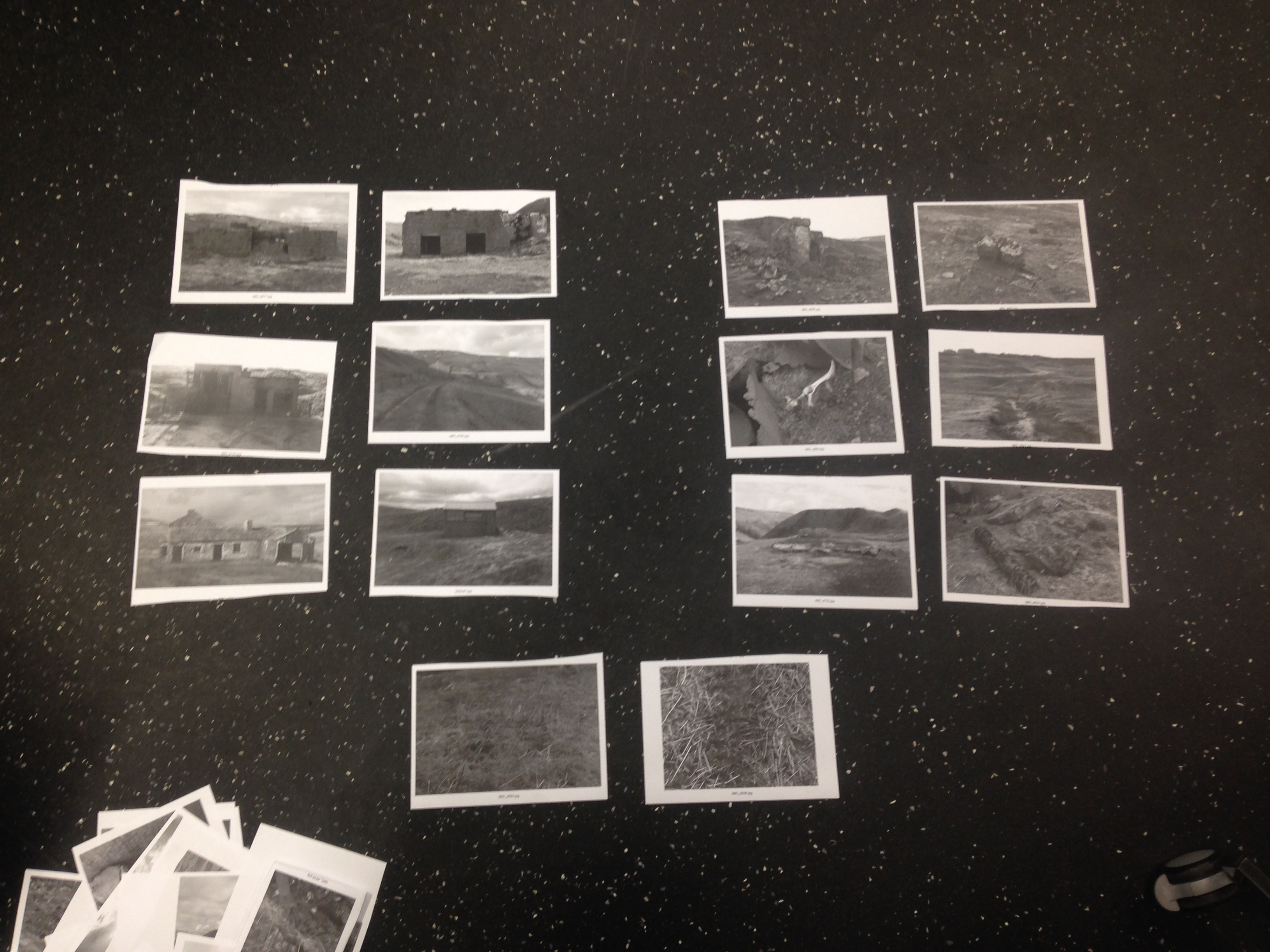
When it came to the post production of the images, I did not feel like the photographs needed much doing to them apart from turning the brightness up and down and heightening the contrast slightly. I also changed the images to black and white to see if this worked better than colour. Admittedly, I preferred the black and white versions more as I felt that it helped pick out different parts of the image and overall making them look a lot sharper. But it also helped fabricate a sense of history to the images and creates an idea of the pictures being ‘timeless’ and not looking like they have been taken in a specific era as I feel that the abandoned buildings and ruins show that themselves and it is not needed to put another time frame on them.
Here is an example of an image before in colour and after in black and white.


I wanted to see if there were any other photographers who used black and white images to create a sense of history to their own images. Sebastiao Salgado’s Genesis series immediately sprung to mind. Not are only are the photographs simply memorising, they also seem timeless and feel like the landscape images could have actually been from the day of its genesis. The way in which is does this inspires me greatly as well as the style of his photography.

Sebastio Salgado -Image from his Genesis series.
At the end of last year I visited the Barbican to see the exhibition- Constructing Worlds: Photography and Architecture in the Modern Age, which consisted of work from 18 artists such as Walker Evans, Hiroshi Sugimoto. The exhibitions aims were to “…look beyond the medium’s ability to simply document the built world and explore the power of photography to reveal wider truths about society.” It also showcased a collection of Bernd and Hilla Becher work. This particular section of the exhibition stood out to me the most because of it’s layout and sequencing. Like most of the Becher’s pieces, the images were placed in groups of the different structures. They were all placed in white frames which allowed the work to flow well through one another, rather than cutting the viewers off and seeing each print separately it made allowed the prints to become one big image.

In relation to my own work, I feel like this layout and framing of the photographs would work incredibly well as I feel that I cannot exhibit just one image.For the audience to get a true understanding of my work, I feel that I need to show a number of photographs in a simple sequence like the Becher’s work in the image above. The next step in getting my work ‘exhibition ready’ is to edit down my pictures to create a smaller series of strong images. I will also be able to see what images work well along side one another and what doesn’t.
I planned to go up to County Durham for four days to explore the area looking for these remote places and derelict buildings in the rural area of the Durham Dales. Luckily I was able to get a sufficient amount of images before the snow started to fall heavily. Because of the Dales being such a remote area, I was able to take the time to focus the solely on finding the different buildings and ruins and concentrate on how I was going represent my ideas through this set of photographs.
Unfortunately I decided against using the mamiya RB67 as I was unable to get the camera and its equipment up with me and back in time to return it to the media loan shop. So all these photographs are taken on a digital camera. While looking at different bodies of work, I could see references and elements of the new topographics style within each artists work. This could have been for the simple fact that the main focuses were of man made buildings and the structures. But this new topographics style really influenced me in the way I wanted to photograph the buildings.
I also focused on the surrounding elements of each areas which showed different human and animal presence for example, gun shells, technical tracks, animal bones and old pieces of metal scrap from the old mining buildings. As I think these objects are important segments of the whole project.
Underneath is a contact sheet of the original images. I decided to take in the photographs in colour as I was still unsure as to how I wanted to use colour in the series, I plan to change them to black and white to see what looks aesthetically better and what ties in with my project more.
Whilst taking the images, I felt that the series should be framed when exhibiting as I feel this would tie in with the ‘traditional’ style of photography I have produced.
